The advertorial is the long-form copy that takes problem-aware traffic and walks them through the full education arc — from "I have this feeling I can't name" to "this specific molecule is the only thing that solves it" — without the reader ever feeling like they're being sold. Done right, an advertorial is the highest-leverage piece of copy in your entire funnel. It does the work of a full sales conversation in 1,500-2,500 words. Brands like Resilia print $600-800k/day off advertorials they wrote once and have been iterating on for years.
Workflow order matters here. Even though the Catalyst sub-page comes first in the reading order of this module (insane-first), in the actual workflow the advertorial gets written FIRST. The Catalyst ads are then reverse-engineered from the advertorial — same avatar, same mechanism, same opening hook — engineered to drive exactly the right person into exactly the right opening paragraph. You don't write Catalyst ads first and then figure out where to send them. You write the advertorial, lock the angle, then build Catalyst ads to feed it.
This sub-page covers the full advertorial production workflow with Claude. Same example product as the Catalyst sub-page — Microingredients Astaxanthin — pulled from Amazon as a public stand-in. By the end you'll be able to take any product, build the intent layer, write the rough draft, iterate to a winning headline, format it into a deployable HTML page using a Claude skill in whatever visual style fits your brand, and ship it into GemPages. The Catalyst ads in the previous sub-page were built off this exact advertorial — go back and read them with the funnel order in mind.
What an advertorial is and isn't
An advertorial is long-form copy that converts cold traffic into buyers without reading like a sales pitch. It can take any voice — editorial publication, first-person diary, founder letter, doctor's note, listicle, testimonial story — whatever fits your brand voice and avatar. The format isn't fixed. What's fixed is the job: walk the reader through a problem, eliminate the wrong solutions, build belief in a specific mechanism, and introduce the product as the inevitable answer.
What it isn't:
- Not a sales letter (no "Dear Friend" opening, no underlined red text, no "buy now or lose forever")
- Not a product page (the product appears late, in passing, almost reluctantly)
- Not a blog post (every word is engineered for conversion, not SEO)
- Not a native ad (native is the compressed form — advertorials are the expanded form)
The reader's experience: "I just spent 12 minutes reading something genuinely interesting and learned something new about my own situation. Now I see that one specific product has the right mechanism. I'll try it."
That's it. That's the entire point of the format. Disguise the sale inside the education.
Format types
Different avatars want different voices. The same astaxanthin product could ship as a third-party editorial OR a first-person diary OR a doctor's letter, depending on which voice your avatar trusts most. The major formats I run:
| Format | Voice | Best for |
|---|---|---|
| Doctor-style | First-person from a credentialed expert | Health/wellness, supplements with clear mechanisms |
| Third-party authority | Editorial publication, behavioral biologist as author | Identity-driven products, primal angles, deep mechanism plays |
| News/journalist | CNET / NYT / MSNBC editorial style | Catalyst-driven angles (regulatory, discovery, systemic) |
| First-person diary | Avatar telling her own story | Emotional/identity products, "I tried this for 30 days" formats, transformation stories |
| Founder letter | First-person founder origin | Story-driven, founder-led brands with strong identity |
| Listicle | "Top 5 [X]" comparison format | Problem-aware traffic, brand-vs-brand competitive plays |
| Testimonial-stack | Multiple first-person voices | Social proof products, established brands with rich review pools |
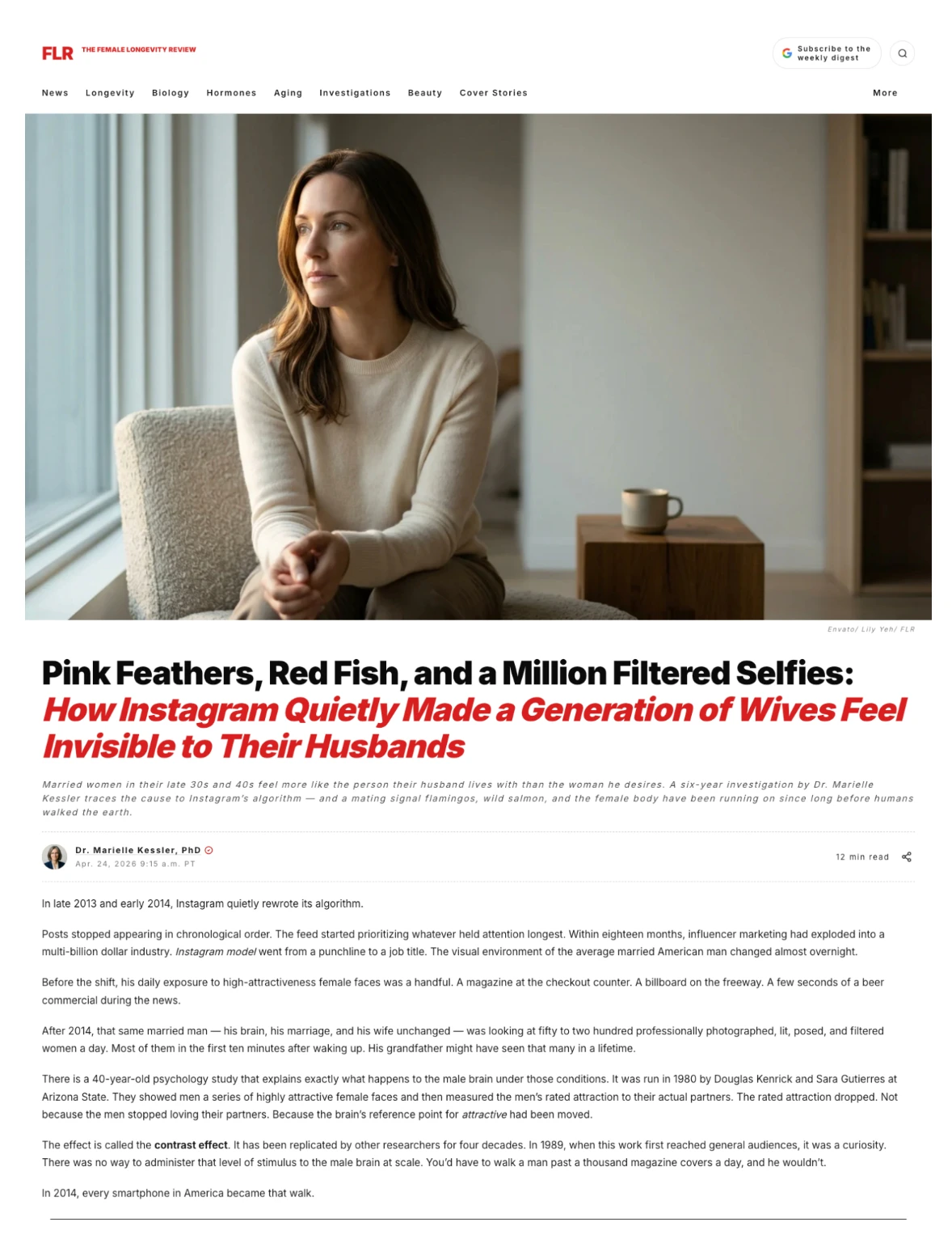
For our Microingredients example, I picked third-party authority — Female Longevity Review as the publication, Dr. Mariel Kessler PhD as the byline. The mechanism (carotenoid pigment + 2014 Instagram algorithm change) works best with that voice for this specific avatar. For a different avatar — say, a younger Gen-Z female who responds to identity-driven voice — the same product might ship as a first-person diary advertorial in her voice. The format follows the avatar, not the other way around.
The intent layer (where 90% of the work lives)
Most operators skip this. They jump straight to "write me an advertorial about astaxanthin." The output is mid because the intent isn't defined.
Define these before writing a single word:
- The avatar. Specific. Married, 32-48, two kids, suburban, $200/mo on self-improvement, body-aware, skeptical, believes in science.
- Awareness stage. For our example: problem-aware, leaning into solution-aware. Reader knows something is wrong, doesn't know what to call it, doesn't know there's a solution.
- Unspoken desire. The deepest want she'd never say out loud. "I want to be the one my husband looks at first when we walk into a room. I haven't been that in a long time. Maybe ever."
- Conscious belief. What she tells herself. "It's my fault. I let myself go. I don't try as hard. I'm older now."
- Unconscious belief. What she actually thinks but won't admit. "He stopped trying. He's looking at someone else. Maybe he doesn't want me anymore."
- The shift the advertorial performs. "Neither of you is to blame. There's a third party you've never been introduced to: biology. Specifically, 200,000-year-old wiring in the male brain that scans for one specific visual signal of female fertility and health."
- The mechanism (the hero). Carotenoid pigment. Real molecule that turns flamingos pink and salmon red. Astaxanthin specifically. Real Nobel Prize history.
- The external enemy. Instagram's 2014 algorithm change. Externalizes the cause off her, off her husband, onto something she can't argue with.
- The justifier she can repeat to herself. A sentence she'll use when she tells her sister why she bought this. "It's not about looking younger. It's about restoring a biological signal that got disrupted by tech."
These eight inputs are the entire frame of the advertorial. Get them right and the rough draft writes itself. Get them wrong and you're polishing a copy that was never going to convert.
Always have an antagonist
This is non-negotiable. Every story has a villain. Advertorials are stories.
Have you ever read a book or watched a movie with no antagonist? No. The villain is what makes the protagonist's journey matter. Same in copy.
For our example, the wrong villain is the husband. Default unconscious blame target. Wrong because: putting the husband on trial makes the reader defensive on his behalf (loyalty), or worse, makes her feel like the advertorial is asking her to leave him.
Better villains:
- Instagram's algorithm change — abstract, undeniable, completely outside the marriage
- Big Pharma — works for some avatars, alienates others (depends on political priors)
- The diet industry / lingerie industry / couples therapy industry — externalize blame onto profit-seeking institutions
- Biology itself — primal wiring that nobody's at fault for
- Animal kingdom — flamingos, redfish, salmon, lobsters (curiosity-gap externals)
The wider, weirder, and more abstract the villain, the better the buy-in. A flamingo cannot be at fault for your marriage. Which is exactly why a sentence about flamingos is going to land harder than a sentence about porn.
Picking the POV (the most consequential framing decision)
POV is the single biggest framing decision in an advertorial. Pick wrong and the credibility of the entire piece collapses. Pick right and the reader doesn't even notice the format — they're just reading.
The rule: the POV has to track logically with the topic and the avatar.
For our Microingredients example, I picked third-party authority. Why: the topic involves animal kingdom biology, evolutionary research, a 1980 psychology study, Nobel-Prize-level chemistry, and a six-year longitudinal investigation. None of that tracks if the narrator is a 39-year-old housewife.
Picture the reader. She's a 39-year-old woman feeling invisible to her husband. She starts reading. The narrator says: "I'm Stacy. My husband stopped looking at me, so I started reading evolutionary biology papers about carotenoid pigment in salmon."
Wait. What? Why would a 39-year-old housewife start reading academic biology papers? She wouldn't. The narrative collapses.
First-person works great for different angles. If the same product were positioned as a diary-format identity story — "I tried everything to feel pretty in my own skin" — first-person POV would crush. Founder stories, testimonial-stack advertorials, "I tried this for 30 days" diary formats all benefit from first-person voice. The voice fits the topic.
Third-party authority works for THIS specific topic because the mechanism is research-driven. A behavioral biologist publishing in an editorial review tracks. "A six-year longitudinal investigation by Dr. Mariel Kessler" tracks. The third-party scaffolding is what makes the science feel earned.
The decision tree:
| Topic + angle type | POV that tracks |
|---|---|
| Research-heavy mechanism, primal/biology angles | Third-party authority |
| Identity, transformation, founder origin | First-person diary |
| Doctor recommendation, clinical mechanism | Doctor-style first-person expert |
| Comparison ("I tested 5 of these") | First-person reviewer |
| News-event-driven, catalyst-style | News/journalist third-party |
| Founder origin, brand-led | First-person founder letter |
Match the POV to what would actually be believable for the topic. That's the entire framework. The Female Longevity Review framing is one option of many. Pick what fits.
Verify your facts (Claude hallucinates)
Real specifics build trust. Fake specifics get caught.
Claude will hallucinate confidently. Dates, study names, researcher names, percentages. You have to verify.
In the Microingredients build, I checked:
- Instagram launch date: 2010 (verified)
- Instagram model culture rise: mid-2010s, specifically 2014-2016 (verified)
- Richard Kuhn (German chemist) and astaxanthin: real — won Nobel Prize in 1938 for carotenoid work
- 12mg dosing for skin coloration: real — backed by dermatology research
- Now Foods 2023 astaxanthin product audit: referenced as an analog — there are real industry tests on supplement dosing accuracy
When you can use real science, use it. When you can't verify a specific number, leave it vague or replace with directional language ("research suggests," "studies indicate") rather than fabricating a precise but wrong stat.
This is one of the most underrated quality gates. A single fabricated stat is what gets your ad reported, your account flagged, or your brand featured in a "this brand is lying" thread. Don't take the risk. Verify.
8th grade reading level — the idiot test for copy
Same principle as Catalyst headlines. Apply it to every paragraph of the advertorial.
If you write "cortisol" — half your avatar pauses. Replace with "stress hormone." If you write "endogenous carotenoid synthesis" — almost everyone pauses. Replace with "the body can't make this pigment on its own. It comes from food."
As simple as possible, but not simpler. Idiot-proof the language without dumbing down the substance. The reader at 11pm on her phone, browsing while distracted, has to be able to follow every sentence without re-reading.
If she has to re-read, she scrolls.
The English-class structure (thesis → outline → rough → final)
This is how I write every advertorial. Came directly from AP English in high school.
Step 1 — Thesis. One or two sentences capturing the entire argument. "Married women in their late 30s and 40s are quietly losing their husbands' attention because of a 2014 Instagram algorithm change that overwhelmed a 200,000-year-old male brain pattern. The biological signal those husbands' brains are still wired to read is carotenoid pigment in skin. Astaxanthin restores that signal."
That's the thesis. Everything else is execution against it.
Step 2 — Outline. Section by section, the structure of the argument. The standard structure for advertorials in this format:
- The hook — opens with the curiosity-gap headline mechanic
- The wound — names what the avatar feels, makes her feel seen
- Permission slip — lifts the blame off her
- The villain reveal (Part 1) — eliminates wrong theories one by one
- The villain reveal (Part 2) — introduces the actual cause
- The mechanism layer — animal kingdom, real science, Nobel Prize
- The hero molecule — astaxanthin specifically, why it works
- The comparison study — third-party review of all products
- The CTA wrapper — editor's note framing the offer
- The close — repeated CTA, urgency, final reframe
Step 3 — Rough draft. Have Claude write the full draft against the outline. Don't try to design the page yet. Words only at this stage. Just copy.
Step 4 — Read as if you didn't write it. This is the move most operators skip. Walk away for 10 minutes. Come back and read the rough draft cold. Where do you trip? Where do you get bored? Where does it sound AI-generated? Mark every spot.
Step 5 — Final draft. Apply every fix from step 4. Rewrite the weak sections. Tighten. Then run it through the analyze-out-of-100 prompt (covered in Native sub-page) to surface what you missed.
Step 6 — Design layer. Only after copy is final. Format into HTML, add images, deploy. Designing too early forces you to commit to copy before it's ready.
Open with something they already accept
Sales psychology principle. Train the yes.
If I'm trying to sell you on something, I open with: "Do you believe people make money online?" You say yes. "Do you believe you could make money online?" Yes. By the time I ask the harder question — "Are you willing to invest in yourself to get there?" — you're already five yeses deep.
Same in advertorial openings. Open with something universally accepted. Then build outward.
For our example, the opener locked at: "In late 2013, Instagram quietly rewrote its algorithm. Within 18 months, the visual environment of the average married American man had changed permanently."
Universally true. Nobody's going to argue with the year. Nobody's going to argue that Instagram changed. Now you've earned the right to walk her through the rest of the argument.
If the opener was contestable — "Most marriages fail because of porn" — the reader's defensive instinct activates. She's looking for reasons to disagree before you've earned anything.
The 5-theory rejection structure
This is the move that separates real advertorials from amateur ones.
The reader walks in with multiple theories already in her head about why her husband's attention drifted. If you don't address them, she sits there reading your "real reason" while privately holding her own theory. She doesn't convert because her theory is still alive.
The fix: kill her theories one by one before introducing yours.
For our example:
| Theory | Dismissal |
|---|---|
| Porn theory | Roughly 1 in 3 porn viewers is a woman. If porn caused this drift, the pattern would be symmetrical — wives would lose interest in husbands at the same rate. They didn't. The drift only ran one direction. |
| Weight theory | Many of the women writing in were in better shape at 40 than they were at 25. The drift hit them at the same rate as women who put on weight. |
| Therapy/intimacy theory | Couples did the work. Better communication, deeper conversation. Their husbands' attention didn't change. |
| Stress/kids theory | Real but didn't explain why the pattern tracked so cleanly to 2014 specifically. |
| The actual theory | Instagram's 2014 algorithm change exposed husbands to 50-200 attractive female faces per day. The contrast effect (a real 1980 psychology study) recalibrated their reference point. |
Each rejected theory takes 2-3 sentences. Don't over-explain. Just acknowledge → dismiss with a specific reason → move on. By the time you reveal your theory, the reader has been guided through the others and dismissed them with you. Now your theory feels like the only logical answer left.
The animal kingdom layer (don't introduce the product yet)
After the villain is revealed, most operators rush to the product. Wrong move.
Between "here's the cause of your problem" and "here's the product that fixes it," you need a mechanism layer that establishes the science. The mechanism layer is where the reader's belief gets built.
For carotenoid-pigment supplements, the animal kingdom is the Trojan horse. Walk through species that signal mating fitness through color:
- Flamingos. Born grey. Build pink color over years from algae diet. Females pick mates by color depth. Pale males don't breed.
- Wild salmon. Farm salmon is grey. Wild is red. Color comes from carotenoid-rich diet. Indicates fertility, fitness, and successful foraging.
- Cardinals. Same story. Diet-driven coloration. Female selection mechanic.
- Lobsters. Different angle — cooking changes the color. Same molecule, different state. Live blue-green, cooked red. The pigment was there the whole time, just bound differently.
After 4-5 species, the principle is undeniable: mating fitness signals through color in every species where one sex selects mates by sight. And the molecule is consistent — carotenoid pigment, specifically.
THEN: "Humans aren't exempt from this signaling system. Recent dermatology research using a method called Raman spectroscopy has shown that astaxanthin, taken orally, accumulates in human skin. The same molecule that gives flamingos their pink color and salmon their red gives human skin a warm undertone that the male brain reads as a fertility signal."
The product still hasn't been introduced. We've only introduced the mechanism. By the time the product appears in the comparison section, the reader is already convinced this molecule matters.
The mechanism layer + real science
Layer in real specifics:
- Richard Kuhn, German chemist, isolated astaxanthin from European lobster shells. Won Nobel Prize that year. Named the molecule after the lobster (Astacus).
- 40+ years of dermatology research on carotenoid pigments and skin.
- Clinical dose: 12mg/day, ideally with a fat carrier for absorption.
- Now Foods 2023 audit-style finding: independent industry tests have shown that of 22 astaxanthin products tested, 14 failed to deliver the dose printed on the label.
This last one is critical. Reframing the supplement market as broken sets up the comparison study trick perfectly. Now the reader doesn't just need astaxanthin — she needs the right astaxanthin. Which leads us into the comparison.
The comparison study trick
This is the highest-converting structural move in advertorials. Don't introduce your product directly. Position the article as a third-party study comparing all products in the category.
The pitch frame: "Per reader request, our team conducted a four-week placebo-controlled comparison of the top 8 astaxanthin products on the market. Here's what we found."
What this does psychologically:
- Reads as objective. Comparison articles inherently feel unbiased.
- Handles the "they're just selling me" objection upfront. If the article were selling, it would only mention one product.
- Walks the reader through the alternatives. She doesn't have to research on her own.
- Naturally surfaces the winner. The product that scores highest in the comparison feels like the inevitable answer, not a sales pitch.
The structure for our Microingredients example:
| Product | Dose | Result | Note |
|---|---|---|---|
| A | 4mg drugstore brand | No measurable change | Dose too low |
| B | 4mg Amazon-tier | Subclinical | Same problem |
| C | 6mg mainstream wellness | Mild improvement | Real but modest |
| D | 10mg mid-tier | Decent | Some users report improvement |
| E | 12mg without fat carrier | About 1/3 reported strong results | Bioavailability without fat is low |
| F | 12mg, no third-party verification | Mixed results | Source unclear |
| G | 12mg, weak fat carrier | Inconsistent | Some users notice, some don't |
| H | 12mg with fat carrier, third-party verified, algae-sourced | Most consistent results across testers | Multiple users reported husbands noticed before they did |
Pros and cons for each. Pricing only mentioned in the comparison section, never woven into the editorial body. The winner emerges as Product H — which is, of course, our example product (Microingredients Astaxanthin or whatever the actual brand is).
The reader walks away with: "I just learned what to look for in astaxanthin, and only one product hits all the marks."
Handle objections upfront
The single best closing principle in sales:
The best way to close a sale is to handle the objections up front.
If by the time the reader reaches the CTA she has 10 reasons not to buy, you led poorly. Each objection should be addressed inside the narrative — not stacked at the end as an FAQ.
Common objections in the supplement category:
| Objection | Where it gets handled |
|---|---|
| "Supplements don't work" | The Now Foods 14-of-22-failed framing — most don't, here's the one that does |
| "How is this different from collagen / vitamin C / [other supplement]?" | The mechanism layer — different molecule, different signaling system |
| "Can't I just eat more salmon?" | Clinical research showed you'd need to eat salmon every day for the dose, plus algae-sourced is more bioavailable |
| "Is this just dye?" | The dermatology research — astaxanthin actually accumulates in skin, doesn't sit on the surface like self-tanner |
| "Why this brand specifically?" | The comparison study — only product to hit all the criteria |
By the time she hits the CTA, every defensive objection has been addressed within the body. She's left with no remaining reason not to try.
The subscription timeline reframe
Sauce most operators don't run.
Most advertorials promise fast results. "Notice changes in 7 days." Backfires when half your buyers refund at day 8 because they didn't see what was promised.
The reframe: position the timeline as longer. "Most users notice subtle changes by week 3-4. The systemic, long-term result builds over 60-90 days of daily use."
What this does:
- Stops 7-day refund storms. Buyers expect to wait. They don't refund early.
- Increases subscription rate. If permanence requires 60-90 days, monthly subscription becomes the rational purchase.
- Increases AOV. Bundles for "the full 90-day protocol" become natural.
This single line in the advertorial moves single-purchase rate down and subscription rate up. The math always wins.
The headline writing process (80% of the work)
Same principle as Catalyst — most of your time goes here.
For our example, I went through 30+ headline variations across 45 minutes before locking. The CES-style "three random things connected" framework finally cracked it. (Found it by looking at a real CES news headline that opened with "Satellites, PDAs, and 13,000 VRRs.") Applied the same shape:
Pink feathers, redfish, and a million filtered selfies. How Instagram quietly made a generation of wives feel invisible to their husbands.
What this does:
- Three random things connected — flamingos (pink feathers), salmon (redfish), Instagram (filtered selfies). The brain demands resolution. Click.
- No solution introduced. The advertorial gets to do the reveal work itself.
- Specificity disqualifies non-avatars. "Wives feel invisible to their husbands" — only married women self-identify.
- Curiosity gap intact. Headline doesn't answer; it opens.
The 80% rule from the great direct response copywriters: 80% of your work goes into the headline. Spent 45 minutes here, paid back over the entire campaign lifecycle.
The "feel" iteration on the sub-headline
Final lock for our example:
Married women in their late 30s and 40s feel more like the person their husband lives with than the woman he reaches for. A six-year investigation by Dr. Mariel Kessler traces the cause to Instagram's 2014 algorithm change and a mating signal flamingos, wild salmon, and the female body have been running on since long before humans walked the earth.
The "person he lives with vs the woman he reaches for" pairing nails the avatar's exact internal voice. Pick the language she actually uses with herself when she's alone in the bathroom mirror. That's the sub-headline test.
The CNET / news rip method (the format hack)
This is the move that takes you from "I can write one advertorial" to "I can ship five per week in any visual format I want."
Step 1 — Find a news site with a layout you like. CNET, NYT, MSNBC, Infowars, whatever. The visual format that matches your editorial voice.
Step 2 — Full-page screenshot or PDF the page. Capture the entire layout — header, byline, body formatting, image placement, footer.
Step 3 — Drop it into Claude. "Copy this structure exactly. Use it as the formatting template for an advertorial. Insert my copy into this layout."
Step 4 — Claude generates the HTML. Header, navigation bar (non-clickable for our purposes), hero image area, headline, sub-headline, byline, body, image placeholders, comparison tables, CTA boxes, footer. All in one HTML file with CSS inline.
Step 5 — Save as a Claude skill. "Save this as a skill named [news-style advertorial]." Now it's in your Customize → Skills sidebar. Future advertorials = run the skill, paste the copy, get HTML out instantly.
The compounding effect: every news-style format you rip becomes a permanent template in your Claude library. CNET-style. NYT-style. Substack-style. Health-magazine-style. Each one a different visual identity for a different brand or angle.
I currently have:
- The Resilia advertorial skill (medical/wellness third-party authority style — what they actually run)
- A CNET-style news advertorial skill (built during this exact walkthrough)
- A Substack-style editorial skill (for newsletter-feel advertorials)
Each one is gatekept inside the masterclass with its full HTML + CSS source. The principles are here in the case study. The actual skill files live in the masterclass.
Image generation + Shopify CDN + GemPages deploy
Once the HTML is generated, three more steps to ship:
Step 1 — Generate images via the imagen skill.
Once the advertorial copy is locked, run the imagen skill on every image needed:
- Hero image — large header photo at the top of the article
- Byline author photo — face for Dr. Mariel Kessler PhD
- Section illustrations — one per major section break (porn theory rejection, animal kingdom flamingos, comparison study)
Generate 3 variations of each, pick winners, iterate the losers (covered in Native sub-page).
Step 2 — Upload images to Shopify Files for CDN URLs.
In Shopify admin → Content → Files → upload each image. Copy the CDN URL for each. Insert into the HTML where the placeholders are.
(There are workflows where Claude can upload directly to Shopify via API, automating this step. I haven't fully trusted the automation yet — manual upload takes 5 minutes and gives me eyes-on each image before it goes live. Worth the time.)
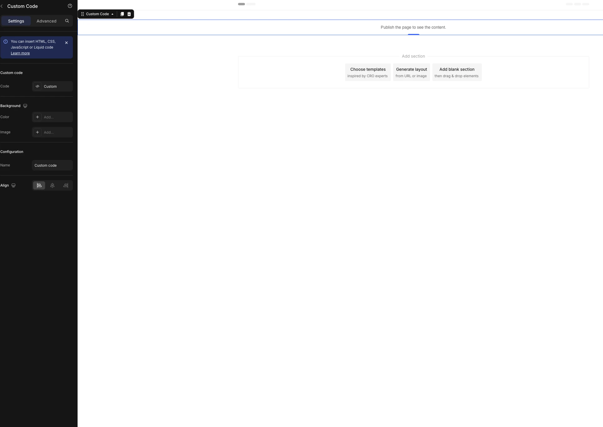
Step 3 — Deploy in GemPages.
In your Shopify admin → GemPages → Pages → Create New Page → Start from Scratch → Landing Page → Create Blank Page.
Critical setup move: name the page AND the page handle upfront. Page handle is the URL slug — visible to customers when they click the ad, indexed by SEO, used by you to track which advertorial concept is which.
For our example: page name = "Evolutionary Theory Advertorial," page handle = evolutionary-theory.
Then: Add Sections → Custom Code → paste the full HTML in. Save → Preview Page. Done.
Set the SEO page title and description (or generate quick versions in Claude). Toggle off the Shopify theme header and footer (the advertorial has its own). Apply settings. Page is live.
The BrandSearch + swipe file rip
Quick tactical layer on the discovery side.
When you're trying to figure out what advertorial format to rip in the first place, the source list:
- BrandSearch — competitor ad research. Filter by category, format, spend level. Find the advertorials currently running in your niche, click through to the live pages, screenshot the structure.
- Alex Fedotoff swipe files — public swipe file resource. Brands like Neuro, Resilia, and others have their advertorial templates archived here. Bookmark the ones that match your category.
- Twitter operators — accounts that post swipe files publicly. Bookmark posts as you see them.
- Manual hunt — when you click a Meta ad in your own scroll, screenshot the landing page. Build your own swipe file over time.
The pattern: find what's working in the wild → rip the format → recreate with Claude. The legality of "ripping" copy is a different conversation (don't lift exact wording — that's plagiarism). What you're ripping is structure and visual format. Your copy is original. Their layout becomes your layout.
The full swipe file repository I work from + my BrandSearch saved filters are inside the masterclass.
The full Microingredients Astaxanthin example
For reference, here's the structure of the actual advertorial I built during this walkthrough (using Microingredients Astaxanthin as the example product):
Publication: Female Longevity Review
Byline: Dr. Mariel Kessler PhD, Behavioral Biologist
Headline: Pink feathers, redfish, and a million filtered selfies. How Instagram quietly made a generation of wives feel invisible to their husbands.
Sub-headline: Married women in their late 30s and 40s feel more like the person their husband lives with than the woman he reaches for. A six-year investigation by Dr. Mariel Kessler traces the cause to Instagram's 2014 algorithm change and a mating signal flamingos, wild salmon, and the female body have been running on since long before humans walked the earth.
Section flow:
- Opener — Instagram's 2014 algorithm change as universally accepted setup
- The wound — six years of letters from women describing the same shift
- 5-theory rejection — porn, weight, intimacy, stress (each dismissed in 2-3 sentences)
- Villain reveal — Instagram exposure → contrast effect → husband's reference point recalibrated
- Animal kingdom layer — flamingos, wild salmon, cardinals, lobsters, the carotenoid principle
- The mechanism — Richard Kuhn, Nobel Prize, dermatology research, 12mg clinical dose, Raman spectroscopy
- Why most products don't work — Now Foods 2023 audit framing (14 of 22 failed)
- The comparison study — 8 products tested, pros/cons each, winner emerges
- Editor's note CTA — direct to product page at reduced rate
- Final note — repeated CTA + the 8-week protocol framing
The full advertorial — the actual HTML with copy, comparison tables, image placeholders, and CDN-ready format — is gatekept inside the masterclass. So is the news/CNET-style Claude skill that generated the HTML. So is the original CNET PDF I used as the visual rip source.
I'm also testing a 3-2-2 method where I split-test 3 different advertorial openers, 2 sub-headline variants, and 2 hero image angles against the same body copy. Methodology + results live inside the masterclass with biweekly campaign breakdowns.
Why this is gatekept
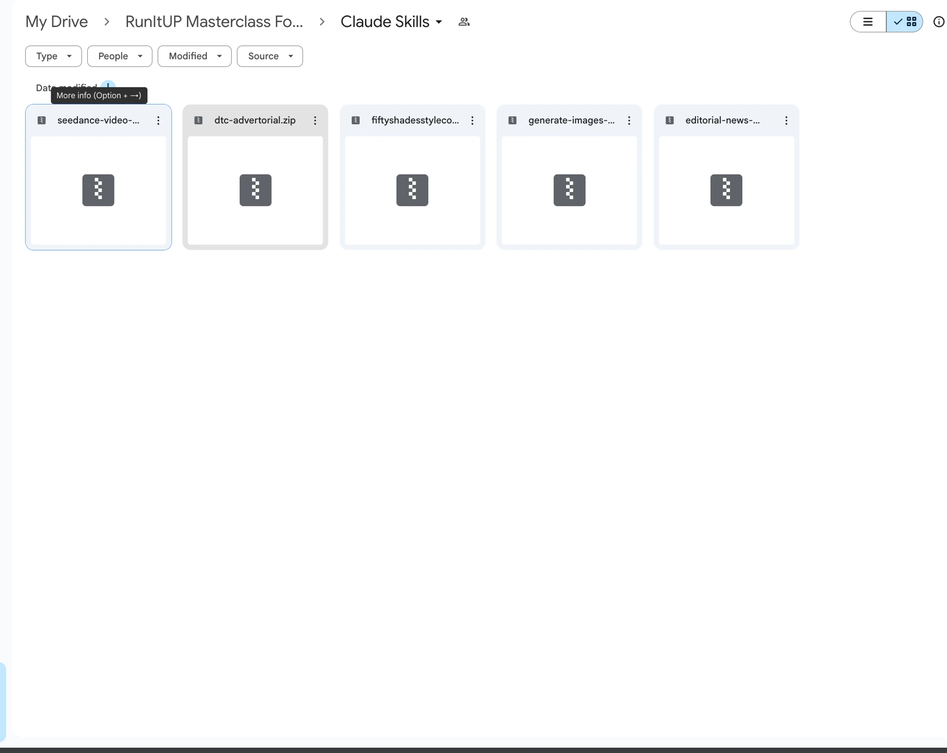
The principles are here. The actual files are inside the masterclass:
- The Resilia advertorial Claude skill (Resilia template format, ready to drop copy into)
- The CNET-style news advertorial Claude skill (the one built during this walkthrough)
- The original CNET PDF that was used as the structural rip source
- The full Microingredients example advertorial HTML (so you can see exactly what shipped)
- The 3-2-2 split-test methodology
- The full advertorial outline prompt, the rough draft prompt, and the analyze-out-of-100 prompt tuned for advertorials specifically
- The BrandSearch saved filters for advertorial competitive research
- Live campaign breakdowns of the advertorials I'm currently running, updated biweekly
Every one of these took dozens of hours to build, test, and refine across multiple brands. The masterclass version stays current as I iterate them on live campaigns.
Want the full Resilia + News-style advertorial skills, the example HTML, the 3-2-2 split-test methodology, and the live campaign breakdowns I update biweekly? All inside the RunItUp Masterclass → Join here
Join now to lock in your rate, prices are increasing quickly.